

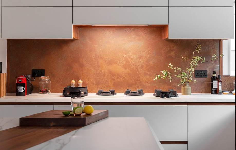
A splashback is one of the easiest places to show personality in a kitchen. Cabinets and worktops are big, expensive decisions that stay for years, but the wall between them is a smaller canvas where colour, texture and pattern can do a lot of work. This article goes through ideas by interior style, so you can see what suits your home and borrow what appeals.
Before You Start: Decide How Bold to Be
Think about whether the splashback should lead or support. A bold splashback sets the tone and the rest of the room plays a quieter role. A calm splashback lets other features, such as stone worktops or colourful cabinets, take centre stage.
A useful rule is to let one element be the star. If the cabinets are bright, keep the splashback gentle. If the cabinets are plain, you have more freedom.
Contemporary Kitchens
Contemporary design values clean lines and a restrained palette. Smooth, glossy surfaces work well here because they reflect light and keep the look uncluttered.
Ideas to try:
- A single sheet of white or pale grey running the full length of the worktop
- A deep navy or charcoal panel behind the hob as a focal point
- A full-height panel from worktop to ceiling for a streamlined look
- Colour-matched wall and splashback for a seamless effect
Keep fixtures simple and avoid too many competing colours.
Traditional and Country Kitchens
Traditional kitchens lean towards warmth and familiarity. Soft tones and a gentle sense of pattern suit shaker doors, timber worktops and classic taps.
Ideas to try:
- Cream, sage or dusty blue to complement painted cabinets
- A subtle texture that gives depth without looking busy
- Patterned designs inspired by tiles, used in a narrow band behind the hob
- A pale colour that picks up the shade of the cabinet doors
The goal is comfort. Avoid very high-gloss, ultra-modern looks if they clash with your cabinet style.
Industrial-Inspired Kitchens
Raw materials, dark tones and a hint of workshop character define the industrial look. Think exposed brick, concrete and black metal.
Ideas to try:
- Dark grey or black panels with a slightly muted finish
- Metallic or mirror-effect surfaces that add depth
- A concrete-look design as a backdrop to open shelving
- Copper or brass accents in taps and lights to soften the hard edges
Balance is key, since too many hard surfaces can feel cold. Introduce timber or textiles to warm the space.
Scandinavian and Minimalist Kitchens
These styles aim for light, calm and functionality. Pale shades, natural wood and uncluttered worktops create an airy feel.
Ideas to try:
- A soft white or very light grey to keep things bright
- A pale green or blue as a gentle accent
- A splashback in a finish that echoes the worktop tone
- Minimal visible joins, so the surface looks like one continuous plane
Here, restraint is part of the appeal. Resist the temptation to add pattern for its own sake.
Bold and Eclectic Kitchens
If you enjoy colour and variety, the splashback can be the star. Eclectic kitchens mix eras, textures and tones, and the key is to make sure the mix feels intentional.
Ideas to try:
- A printed design with a large botanical, geometric or abstract pattern
- A strong single colour such as emerald, mustard or deep red behind the cooker
- A panel that picks up one colour from a nearby painting or rug
- A bright splashback against neutral cabinets for a lively contrast
Limit yourself to one or two strong features so the room does not become overwhelming.
Coastal and Relaxed Kitchens
Light, easy-going and fresh, the coastal look relies on soft blues, sandy neutrals and airy whites.
Ideas to try:
- Pale aqua or misty blue to echo sea and sky
- Soft white with a gentle texture
- A pattern with a subtle wave or pebble effect
- Natural materials like rattan or light wood alongside
Keep the palette gentle, and avoid too many themed items, which can tip the look into cliché.
Using Texture and Finish Creatively
Colour is only part of the story. Texture and finish change how a splashback feels and behaves in the light.
- Gloss: Bright and reflective, good for darker rooms.
- Satin or matt: Softer, with less glare and fewer visible marks.
- Textured surfaces: Add tactile interest but may need more careful cleaning.
- Metallic effects: Catch light and create a sense of movement.
If you use a mix of finishes in the room, such as a matt cabinet with a glossy panel, the contrast can make both feel more distinct.
Working With Lighting
The best splashback can look flat under poor lighting. Think about how the wall will be lit.
- Under-cabinet lights wash the surface and highlight colour and texture.
- Warm bulbs soften cool tones, while cool bulbs sharpen them.
- Daylight shifts across the day, so check how your choice looks in the morning and evening.
Reflective surfaces such as Glass Splashbacks can amplify lighting effects, so it is worth testing samples in your actual kitchen before deciding.
Splashbacks That Go Beyond the Worktop
Not every idea has to stop at the usual height. A few creative options:
- Full-height behind the hob: Draws the eye and protects the wall.
- Feature wall: Carry a pattern across an entire kitchen wall for impact.
- Around a window: Frame a window with the same surface to link the elements.
- Alongside open shelving: Use a calm colour so displayed items stand out.
If your plan includes unusual shapes or heights, a custom approach helps. A tailored panel can follow the exact lines of the wall, which is where a made to measure splashback earns its keep.
Mix Colour With Confidence
If colour choices make you nervous, a simple method helps.
- Choose the main colour from the room, perhaps the cabinets or the floor.
- Pick a secondary shade that sits near it on the colour wheel for harmony, or opposite it for contrast.
- Keep an accent, like a vase or stool, to repeat that tone elsewhere.
This ties the splashback into the room so it feels planned rather than random.
Think About Longevity
Trends come and go, and a very striking pattern may date faster than a plain tone. If you want something bold but practical, consider keeping the main splashback neutral and bringing in colour through accessories, which are easy to change. On the other hand, if a particular design makes you happy, that is a good reason to choose it.
Final Thoughts
Whatever your style, the right splashback helps the kitchen feel finished. Contemporary spaces suit sleek, plain surfaces, while traditional rooms welcome soft tones and gentle texture. Industrial looks call for darker, textured finishes, Scandinavian kitchens favour calm and light, and eclectic rooms can carry a confident print. Look at your cabinets, worktops and lighting, choose how bold you want to be, and test samples in your own space. When the choice feels right at home, it will probably look right for a long time too. For anyone comparing Kitchen Splashbacks, starting with style is the surest way to narrow the field.
